-
1.
Problems reading the graphs? Here is how to do technical analysis so that you can best interpret the data.
- 2. Types of graphs: here’s what they look like based on the data they represent
- 3. How to do technical analysis of market charts? Here are the basics to start with.
- 4. 1) Time period: what does the graph refer to and at what time is it placed?
- 5. 2) Unit of measurement of the data represented in the market graph.
- 6. 3) How was the figure calculated?
- 7. 4) What are the relationships between different pieces of information and how do they compare with each other.
- 8. 5) The method by which the data was extracted (and the source from which it came).
- 9. 6) How has the value of a data item changed over time?
- 10. 7) Anomalies in the distribution of data over time (only for graphs with variation over a period of time)
- 11. Conclusions
Problems reading the graphs? Here is how to do technical analysis so that you can best interpret the data.
Don’t know how to read and interpret market research graphs and would like to learn how best to analyze the data?
Effectively, to interpret a graph one must have some basic mathematical knowledge, at the same time we must also consider that the creator is an excellent storyteller capable of using the most suitable graphs for certain data while also taking into account what the communicative purpose of this information is.
Every data representation tells a story, and we talk about Data Storytelling precisely because the graph itself (and those who put it together) has the role of narrating the data. In this specific case, information collected during market research.
Building on this assumption, which will help you understand whether a representation is clear or not,how to do technical analysis of market charts?
Today we will explain just the basics of this analysis, starting by telling you about the various types of charts.
Types of graphs: here’s what they look like based on the data they represent
Graphical representations of data are a way to show information extracted through a study (in our particular case amarket analysis) in a visually effective way.
Since the purpose of a graph is to aid the reader ‘s understanding of a phenomenon, it is essential that the representation fit the types of data being analyzed… Otherwise anyone who found themselves interpreting the graph would not be able to make sense of it!
In short, statistical data fall into two basic categories, namely qualitative data and quantitative data.
A qualitative datum represents nominal characteristics and is expressed through adjectives or nouns. In contrast, a quantitative datum is represented by measurable characteristics and expressed through numbers.
Here are the main charts used in market surveys based on the data being represented:
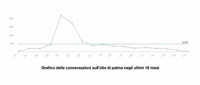
- Cartesian diagrams: take the form of a cloud of points to observe, most commonly, the variation of a quantity as a function of time. These diagrams are used to represent the variation of quantitative data over time. Here is an example:
- Bar graphs, typically used to represent qualitative data. These representations lend themselves perfectly to the comparison of analyses performed on different samples or times. Here is an example from the market study conducted by us at CMI for a lithium battery brand:

- Histograms: these are graphs used to represent quantitative data divided into classes. Here is an example from our market research commissioned by Pampers:

- Cartograms, where information is associated with a geographical representation by map. Here is an example of a cartogram from our market research for the Tucano brand:


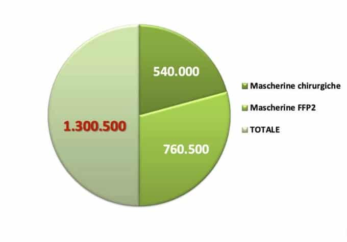
- Pie charts (aerograms): pie charts are used to represent a phenomenon expressed by qualitative data. They first show a total value which is then divided into slices (in a separate figure or in the same diagram), usually of different sizes from each other. Here is an example of a correctly represented pie chart, with a value indicating the total and the different values for the areas into which this total is divided:

And here is an example of how one should NOT ever make such a diagram (as you can see, the total was misrepresented as half the pie and the related slices as the other half… If you find such a representation in market research, you are advised to run for the hills):
Furthermore, graphs can be static, dynamic, or interactive.
We at CMI use the latter representation a lot because we give the reader the opportunity to interact directly with the diagrams, uncovering previously hidden information and applying filters with the goal of obtaining other interesting information.
Now that you know the most commonly used charts in market studies and the two different types of data, let’s go over the basics of technical analysis of these representations.
How to do technical analysis of market charts? Here are the basics to start with.
When we want to read a graph, therefore understand what it tells us and what it represents, we have a number of elements to consider:
- Time period
- Unit of measurement of data
- Data calculation method
- Relationship between different information
- Method of extracting data from the source
- (Possible) Change in data over time.
- Anomalies in the distribution of data over time (for graphs with variation over a given period)
Let’s look at them in detail so that you know what to look for in a market chart.

1) Time period: what does the graph refer to and at what time is it placed?
If you want to do an analysis of a graph you have to go and look at the time variable. Without this variable the graph has no meaning, you cannot place it in any period, and you cannot understand what happened and why!
So the first point to consider during a technical analysis of market charts is precisely time.
Read also: Data Driven media planning: plan your content effectively
2) Unit of measurement of the data represented in the market graph.
When we talk about graphs and charts we are talking about the graphical representations of currencies, units, numbers (e.g., number of searches over time, pieces sold, people) or percentages.
In addition to checking what unit of measurement you find, you should also pay attention to the percentage. If present, you should figure out what the total is and, therefore, what the percentage was calculated on.
3) How was the figure calculated?
The third factor to be analyzed in a market graph is how the figure was calculated.
Is this an absolute or total figure on a given baseline?
The first case, that is, the absolute data, can be manifested, for example, when the data studied come from surveys: we can have data from 2,500 respondents out of the same number of people surveyed.
The second case, total data on a specific baseline, occurs when the data includes a total at a specific location, a specific group of people, and so on.
For example, we talk about data over a total when we represent a value of Google searches over time or a certain number of people who responded in a certain way to a survey.
In this case I need to understand what is the baseline on which the data was calculated, such as on a number of people, a country, an area etc.
4) What are the relationships between different pieces of information and how do they compare with each other.
More than absolute data, what is of interest in the study of a graph or several graphs is the comparison of the various data.
For example, if I compare several competitors, I do not go to look at the absolute figure but rather who has more site visits/assets/customers satisfied than another.
Instead, if I have a bar graph I go to see who is at the top and who is not, if I have a pie chart with percentages I look at who has the biggest slice.
The point is to find out what is the predominant value that emerges among the others!
5) The method by which the data was extracted (and the source from which it came).
The fifth point to investigate during a technical analysis of market charts is the method by which the person who carried out the study obtained the data and from what sources he or she drew the information. Evaluating method and sources also allows you to understand the reliability of the representation.
For example, you might ask: whoever did themarket analysis and made the graph used software to extract the data, did they do a survey, or did they use another method?
Read also: Statistical methods for market research
6) How has the value of a data item changed over time?
If you have the ability to do this, perhaps drawing on other studies and other charts, you can check a particular value and understand:
- what the current figure is
- what was the figure in the past
- What the data might look like in the future
Understanding this information is straightforward if you analyze a graph representing a change over a given period of time.
And, by the way.
7) Anomalies in the distribution of data over time (only for graphs with variation over a period of time)
If you are looking at a graph with variation over time, it is critical to check for abnormal points, such as points where particular spikes occur.
At this point you can determine whether the variation is due to particular factors or seasonality.
If you do not have a graph that changes over time but is a snapshot (such as a bar graph or pie chart) you cannot do this work precisely because you have no way to see any peaks and analyze the changes that have occurred over time.
Conclusions
Graphs should always be able to produce useful information; they should not represent a lot of data just for the sake of including it. It is necessary for those who represent them to think about the flow of information and the benefits of reading these representations.
It is also essential that the person responsible for representing the data be a professional in the field or that the representation of data in graphs be done by powerful software.
If not, he may make serious mistakes…. The most direct consequence would be the inability to interpret the data in the correct way.
Considering that a graphical representation should make it easier to read the data, entrusting its fine-tuning to an inexperienced person would eliminate the advantages given by the graph itself.
Would you like to have market research with reports containing clear, detailed, and easy-to-read diagrams?
We at Central Marketing Intelligence can do this and more!
Contact us now to request a free consultation-we are here to support you to the best of our ability.